A visual identity built without a clear brief will always feel approximate. Here's how to translate your brand mythology into something you can actually see.

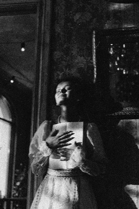
The Parlor
Brand identity design that helps people see the value of what you do, whether you’re evolving or giving your brand long-overdue attention.

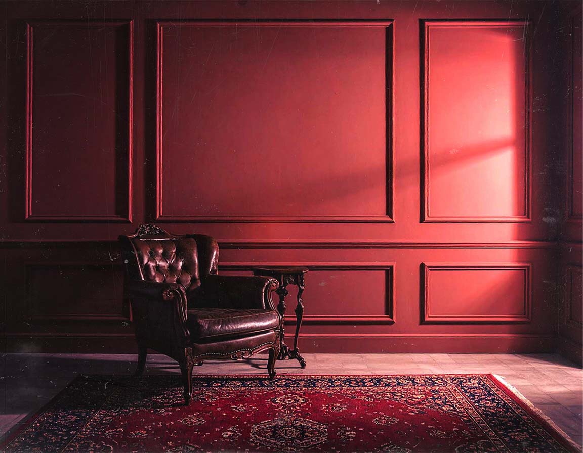
The garden
A brand management subscription that handles your marketing materials, so you can get back to what you do best.
Free Resources
Free brand resources to help you tell your story. Because your brand deserves depth, not guesswork.
There is a particular kind of frustration that comes from a brand that looks fine and feels wrong.
Everything is technically competent. The logo is clean. The colors are cohesive enough. The photography is well-lit. And still, something is off — a flatness, a distance between what the brand looks like and what it actually is. Customers respond adequately. The right ones do not quite light up the way you hoped. You find yourself explaining your brand in conversation in ways that the visuals never seem to do on their own.
This is what happens when visual decisions get made before the underlying work is done. When the look of the brand is chosen first — based on what is trending, what the designer suggested, what felt right in a vacuum — rather than derived from everything the brand has already established about itself.
A visual brief built on top of a clear mythology does not have that problem. It has a specific place to come from.
The visuals are not there to make things look good, though looking good is a fine outcome. They are there to express what your brand believes — to make your mythology visible, to confirm the feeling a customer has already started to form before they read a single word.
Every visual choice carries information. Color communicates temperature, weight, and energy before anyone consciously registers it. Typography carries personality — the difference between a serif and a sans-serif is a felt distinction, not just an aesthetic one. Imagery selects for a taste level, a sensibility, a set of implied values. Proportion and spacing communicate confidence or anxiety, generosity or constraint. These choices are not neutral, and when they are made without a clear brief, they tend to communicate something approximate — close to the brand's meaning but not quite right or inconsistent.
The goal is not beautiful for its own sake. The goal is coherent — a visual system where every choice points toward the same central idea, and that idea is the one your creation story, your belief system, your metaphors, and your audience definition have already established.
This is the part that surprises founders who have come to think of visual branding as a separate creative exercise, something that happens in a design studio largely independent of everything else they know about their business.
The visual brief is where everything you have already defined becomes visible.
Your creation story carries a mood — the emotional texture of the problem you were solving and the world you were trying to build. That mood belongs in your visual palette. Your belief system has a tone — particular values produce particular aesthetics, and the visual language of a brand that believes in rigor looks genuinely different from one that believes in warmth. Your central metaphor has a direction — if your brand is a threshold, that shapes your visual choices differently than if it were an archive, a hearth, or a current of water. Your ideal audience has a taste level — they are already attracted to certain visual cues and repelled by others. Your brand should speak their visual language without simply imitating it.
By the time you reach the visual brief section of the workbook, you have already done most of the work. What you are doing now is translating — taking everything internal and making it external, taking everything felt and making it seen.
A logo is not a brand identity. Neither is a color palette. A moodboard is not a visual system. These are components, and components without a system connecting them will drift.
What you are building is something that can stretch across your physical space and your digital presence, across your packaging and your content, across a new hire's first attempt at a social post and a vendor's interpretation of your visual guidelines. It should hold its shape across all of those contexts because it is built around a central logic, not just a set of aesthetic preferences.
A system has rules, but more importantly, it has reasons. When the people expressing your brand understand why the choices were made — why this color and not that one, why this kind of image and not another, why the typography is set the way it is — they can make new choices within the system that still feel right. When they only have the rules without the reasons, every new context requires another round of approval, and the brand becomes dependent on the founder's eye for its own consistency.
That dependency does not scale. The system does.
The visual brief is the layer of brand work that most benefits from collaboration — not because founders lack taste or instinct, but because translating internal clarity into external expression is a particular skill and the distance between what you mean and what someone else sees is much easier to navigate with a partner who understands both sides of that translation.
The workbook will take you through the brief in a way that makes your visual direction explicit and usable, whether you are working with a designer, refining an existing identity, or building something new from the foundation up. What it gives you is clarity of intent — the why behind the what — which is the most useful thing you can bring into any visual conversation.
If you have been working with designers and finding that the output never quite lands the way you hoped, the brief is almost always where the gap lives, not in the execution but in the articulation that preceded it. Getting that articulation right on paper, before the work begins, changes the quality of everything that follows.
The Brand Audit includes a visual review that often highlights the difference between what a brand is trying to communicate and what is expressed in the visuals. If that gap feels familiar, it is worth looking at before the next design round begins.
You have now moved through every layer of the mythology — from the moment the brand became inevitable, through the beliefs, symbols, language, behavior, and audience that give it shape, to the visual system that makes it visible.
None of this needs to be perfect to be useful. The workbook is not a test. It is a thinking tool, and thinking tools get more useful the more honestly you use them. Come back to the sections that felt incomplete. Revisit the answers that felt too safe. Let the later sections sharpen what you wrote in the earlier ones.
What you are building is not a brand document. It is a foundation — something solid enough to carry the weight of everything you are still building on top of it. That foundation is already inside your business. The workbook is how you make it structural.
Chicago, IL USA. © 2016-2026 Viki Sisnette. All rights reserved.