Before anyone reads a word, they've already decided how they feel. Here's how symbols and metaphors shape that feeling.

The Parlor
Brand identity design that helps people see the value of what you do, whether you’re evolving or giving your brand long-overdue attention.

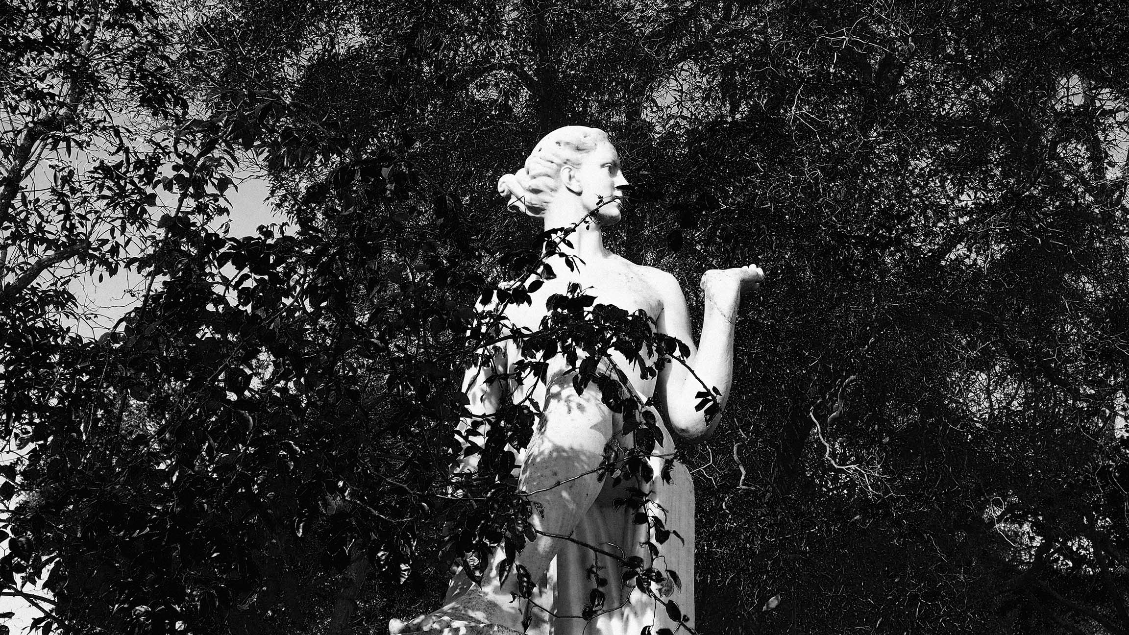
The garden
A brand management subscription that handles your marketing materials, so you can get back to what you do best.

Free Resources
Free brand resources to help you tell your story. Because your brand deserves depth, not guesswork.
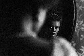
Before someone reads a word you have written, they have already decided how they feel about you.
This is not a flaw in the way people process information. It is just how attention works. People scan before they settle. They take in light and shape and texture and proportion and derive a feeling from all of it in less time than it takes to read a sentence. By the time they are actually reading, the emotional context is already set. Your words either confirm or complicate feelings that have already arrived.
Symbols and metaphors are how you shape that feeling on purpose.
A metaphor explains your brand through something familiar. It is the underlying idea — the through-line that connects what you do to something the reader already has a felt sense of. A compass. A threshold. A slow pour. A room that holds you.
A symbol makes that metaphor visible. It is the specific choice — the color, the object in the photograph, the particular word, the texture on the packaging — that carries the metaphor without announcing it. You feel warm because of the light temperature, the ceiling height, the material under your hands, and the pace at which someone moves toward you. Every one of those details is a symbol. Together, they express the metaphor.
When these two things are aligned, it creates brand recognition. Someone can glance at your content, your space, your product, and know it is yours before they read the name. That is not luck, and it is not magic. It is a system, built around a central idea, expressed consistently enough that the idea becomes familiar.
The most useful way into this is to set aside everything about how your brand currently looks and ask a different question: what changes for someone when they choose you?
Not what you offer. What changes. Because the transformation is where the metaphor lives.
A brand that brings order to chaos might reach for architecture — clean lines, structural imagery, language that evokes building and foundation, and things that hold. A brand that creates permission — that gives someone access to something they wanted but were not sure they were allowed to have — might reach for doors, keys, thresholds, the feeling of being let in. A brand that slows things down in a world that moves too fast might reach for candlelight, ceremony, the unhurried gesture, the thing that takes longer because it is worth it.
None of these are prescriptions. They are starting points. The question is what the transformation in your specific brand actually feels like — and whether the symbols you are currently using point toward that feeling or toward something else entirely.
There is a version of this work that produces very beautiful, very hollow brands. It happens when a founder selects symbols based on what looks good in their market, what is trending in their aesthetic category, what photographs well, rather than what genuinely connects to what the brand believes and what it actually does for people.
An aesthetic without alignment breaks trust faster than inconsistency, because it creates a specific kind of disappointment. The person who walks into your space, or opens your packaging, or reads your first email has been promised something by the visual. If what they experience does not match what was promised, the disconnect registers immediately. They may not be able to articulate it, but they feel it. And that feeling is hard to recover from.
Decoration does not stick. Meaning sticks. The goal is not a beautiful brand — it is a coherent one, where the beautiful things are beautiful because they are true, not because they were borrowed from somewhere that looked right.
A symbol only becomes recognizable through repetition. One well-chosen image does not build brand recognition. The same image, the same color, the same kind of light, the same quality of gesture — expressed across your physical space, your digital presence, your packaging, your communication — that is what creates the feeling of a world.
This is also where most brands lose the thread when they scale. The original symbols were chosen by one person with a clear instinctive sense of the brand, and then handed off to a team, a vendor, a new hire, a third platform — and each handoff introduces a small variation. The variation is invisible in isolation. It accumulates into something that starts to feel scattered.
Maintaining that consistency is part of the work that happens in The Garden — the ongoing tending that keeps a brand from drifting as it grows. But the symbols have to be established clearly before they can be maintained. The workbook is where that clarity gets built.
The symbols and metaphors section of the workbook will ask you to look at what your brand is currently expressing and trace it back to the central idea you are trying to communicate. Some of it will already be there, working quietly. Some of it will be borrowed or accumulated rather than chosen — and it will be useful to see which is which.
You do not need to redesign anything to do this work. Start with noticing. What does your brand currently look like? What does it feel like? What is the transformation you are promising — and does everything pointing toward your brand point toward that transformation, or somewhere else?
That question is worth sitting with. The answer will tell you more about where your brand is and where it needs to go than almost anything else in the workbook.
Chicago, IL USA. © 2016-2026 Viki Sisnette. All rights reserved.